
Have you ever clicked a link to a sales or landing page, only to navigate away several seconds later? One would think that given the importance of these types of pages to converting sales, web developers would spend a significant amount of time on optimizing them to ensure they will produce the best results. In many cases, however, these pages are dry, uninteresting and simply do not provide the kind of conversion value they should.
Creating a landing page that succeeds at converting sales or driving other actions is a true art.
If lead generation is important to your business, you can’t ignore landing pages, or worse yet – throw them together without split testing relevant components, design elements, verbiage and different version for different targeted audiences. No matter how much time and money you spend on perfecting the sales funnel, if the landing page doesn’t connect with your audience, they will leave. With that being said, we understand that costs are a factor to an organization's ability to produce the ultimate landing page. However, we also understand that testing costs has a direct correlation to return-on-investment. The need for a structured, process-driven approach to conversion optimization (CRO) cannot be stressed enough. A structured CRO (conversion rate optimization) program is essential to deliver consistent and repeatable improvement in conversion rate and user experience (UX). Only a few organizations and agencies have adopted this approach to optimizing conversions; even fewer have been able to master it. Why? Because mastering conversions also requires a great strategy, a great business mind, a great coder and an excellent design team – skills that are incredibly rare under one roof.
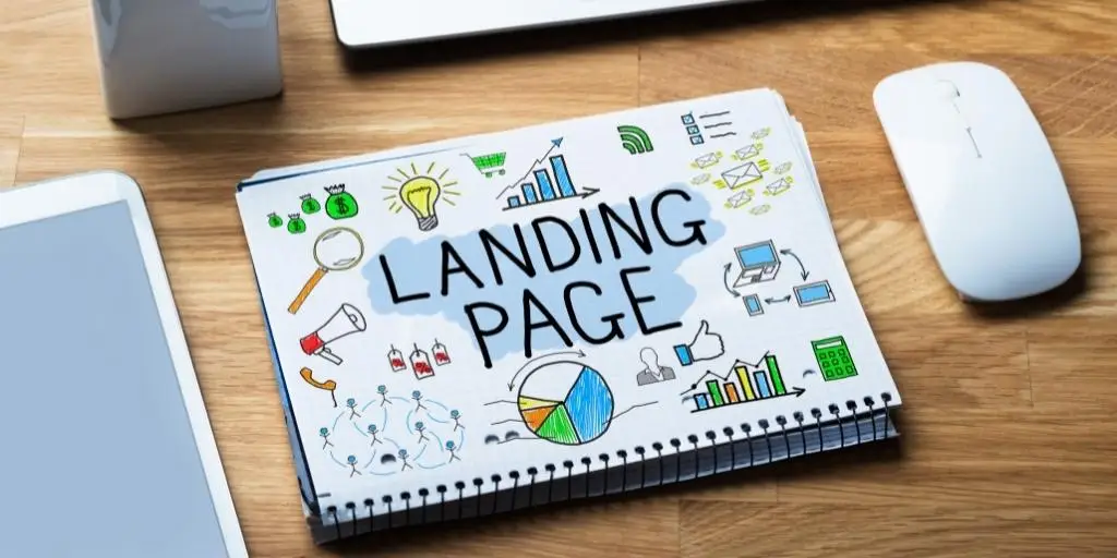
In this series, Landing Pages that Convert, it is our goal to not just talk about optimizing a landing page but to describe each element in detail.

Over the coming weeks, we are going to go into detail about the various elements that make up a successful landing page, as described by Digital Marketer’s Justin Rondeau and in “Digital Marketing For Dummies“ with Russ Henneberry. Here are some of the specific items we will focus on:
- Market callouts: The language on your page should help your visitors to immediately determine that they are in the right place and that the page contains information that will be useful and directly helpful to them.
- Clarity: All landing and sales pages should have a single, clear message and make just one clearly identifiable offer. A landing page should not be doing too much, otherwise it will confuse the visitor. You’d be surprised how much a simple design with more white space can lead to more conversions. After all, your obsession can lead to limiting results.
- Understandable: A visitor must be able to quickly figure out exactly what it is you are offering, otherwise you risk losing their attention. Knowing what is understandable should be proven through testing and not intuition and gut feel. Getting to understandable can mean accepting failure – and that is ok.
- Compelling headlines: A concise, benefit-laden headline that grabs the attention of your reader is a key ingredient in converting visits to sales. Really try to understand where your target market lives online and make your messaging line up with your landing page experience.
- Calls to action: Not just calls to action, but placement of calls to action. Having a call to action above the fold can ensure greater visibility.
- High-quality buttons: All buttons used on the site should have contrasting colors and custom text that fits within your business’s personality. This seems like a no brainer but often times designers will trip you up here. That subject alone reminds me of out article on what Infusionsoft cannot do – read it, you will see how it ties into the line.
- Social media: By now, most people understand the kinds of benefits that an effective social media marketing campaign can have for their company. They also have an understanding of the kinds of content that they should be sharing on their pages to reach out to their customers. Your landing pages should contain social media sharing buttons, testimonials and “as seen on” logos that help people know they are making smart decisions with their purchase while also giving them additional avenues through which they can follow your brand. Social proof is a powerful and persuasive concept. The concept being that you are more likely to convert if you see that others before you have, and were glad they did.
- Limited navigation: Your landing pages should have limited navigation options — they either opt in or exit. This will help you maximize conversions, because you are limiting the potential distractions available to your visitors while focusing their attention on the opt in fields. What makes up a good website is always evolving. In 2017, you can expect to see even more changes, as companies up their mobile game, add video content, and expand into apps. Old-fashioned websites that fail to consider the user’s needs will be less competitive.
- Visual cues: Arrows, boxes and other visual devices should be used to draw attention to the opt in field or call to action area. Directional cues are the things on your page that influence (unconsciously, again) where your traffic focuses its attention.
- Hero shot: A high-quality image or graphical representation of your lead magnet can help you to improve conversions. The idea here is to get your customers to empathize and place themselves in a scenario where they are using it. If you have poor-quality photos, you can’t expect to maximize your sales potential, as your photos give your customers an idea of what they can expect out of your product.
- Smart opt in fields: Your forms should ask for as little information as possible to encourage people to sign up. People are much less likely to opt in if they must provide a ton of information.
- Source congruency: The text and imagery on landing pages should ideally match the text and imagery that was in the advertisement that directed the visitor to the landing page. A lack of alignment of elements on a landing page with the campaign goal is likely to result in friction.
- Brand consistency: Your landing pages don’t all have to have your logo, but they should all have a consistent feel and look that matches your brand identity and other branding materials. Bad brand consultants are a dime a dozen in today’s business world, but fortunately there are plenty of success stories out there as well.
- Privacy policy and TOS: Privacy policies and terms of service are required by law to advertise on some sites, but they are also good for conversions because they show your customers you care about their privacy and have taken the time to create such a policy for them.
We will expound in greater detail on these aspects of outstanding landing pages over the next several weeks. For more information at any time, feel free to reach out to us at Viral Solutions, and our team of trusted digital marketers will be happy to answer any questions you have.
