

Have you ever said to yourself, “What did I get myself into?”
If you have been struggling to create a lead and sales-generating website that markets itself, you have likely asked this question (or yelled it) more than a few times.
You can never really understand what it takes to create/optimize/market your website successfully until you dive into the trenches and get your hands dirty. And, the deeper you dive, the more reality sets in and you reach a point where it’s too late to turn back.
The good news is that your website can be a sales and lead-generating machine, and getting there doesn’t have to be a laborious, time-consuming process.
We realize that figuring out all of this digital marketing stuff can be difficult—but it should also be fun (yes, we said fun). It’s our goal here at Viral Solutions to help businesses remember why they got into this game in the first place and give them the tools and education to get re-excited about their businesses again.
Let’s talk websites.
Your website is vitally important because, well…it’s your main hub—the place where it all begins and ends, and the first place your potential customers may discover your brand. And if it isn’t user-friendly, it can tarnish your visitors’ experience and send them straight to the dreaded “back” button. To create a lead and sales-generating website, it must satisfy users.
But, no worries because we got your back! In today’s post, we are revealing some of our top website tips to help you improve your website design to make it more user-friendly.
We will dive into some tried and true practices that have worked for many businesses. These are the same web design tactics we use for our clients that have helped them keep visitors on their sites and buying more.
But, before we get into actionable plans, let’s make sure we are on the same page…
Your Website Isn’t a Tech Jungle…So Stop Adding New Features
They call it “Shiny New Object Syndrome.” Let me explain…
You know how when you start using a new marketing tactic, you get excited, but then things start to go downhill quick?
The initial excitement wears off because the tactic takes longer to put into place than you expected. And then, instead of pushing through the roadblocks to see it to completion, you start searching for another “shiny new” tool to get your initial excitement back.
Rinse and repeat. Rinse and repeat.
You can see the problem with this. You are working hard (too hard) but never actually moving the needle.
Now we are not saying this is you, but if you have been salivating over every new tech innovation to come out of Silicon Valley and adding feature after feature to your site, your website may be a tech minefield—that will deter visitors at every turn.
We also aren’t saying that these new shiny tactics aren’t powerful to use. We even wrote about some of them here, here, and here.
But spraying air freshener on a pile of decaying garbage doesn’t solve the real problem. Similarly, adding new tech-savvy tools to a poorly-constructed website foundation won’t help your cause. Please don’t be this guy…

Forget all of this tech stuff for a second. Here’s the million-dollar question:
Can your website visitors find exactly what they are looking for in the quickest time possible? If your tech tactics contribute to this goal, use them. If not, discard them for now.
How do you know if your website is fundamentally functional and user-friendly so your users don’t abandon it?
For one, it needs to be mobile-friendly.
Your Website Needs to be Mobile-Friendly (For Real)
Creating a mobile-friendly website isn’t a shiny new concept. It’s a must-have if you want to compete in today’s online marketplace. If you want to know how and where to improve your visitors’ user experience, start there.
Strong, sales-generating websites are mobile-friendly websites. Here are some reasons why you want to be optimized for mobile:
- Mobile users spend 2x the minutes of desktop users. If you don’t have a mobile site, you are missing out on this exposure.
- Google favors websites that have mobile versions. What does this mean? If your competitor has a mobile website and you don’t, there’s a good chance (barring other factors) they will rank higher than you.
- More personalization options – Since people carry their phones with them everywhere, using mobile personalization methods will allow you to dig deeper into your prospects’ behavior and learn more about them. This increases conversions.
- Eighty percent of social media activity occurs on a mobile device. This means that most of your social media followers click to visit your website from their mobile devices. If your site isn’t optimized, you will diminish their experience and likely suffer from high bounce rates (we will talk about bounce rates later in this article).
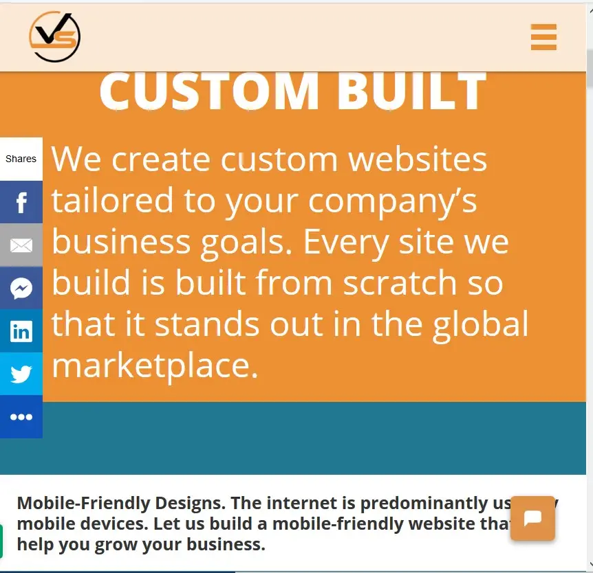
A mobile-friendly website is optimized for a small-screen experience. One way to do this is to make your site responsive. A responsive website resizes to fit any size screen without altering the images and content. Here is an example of responsive design.
Here’s a snippet of a page on our website at full width:
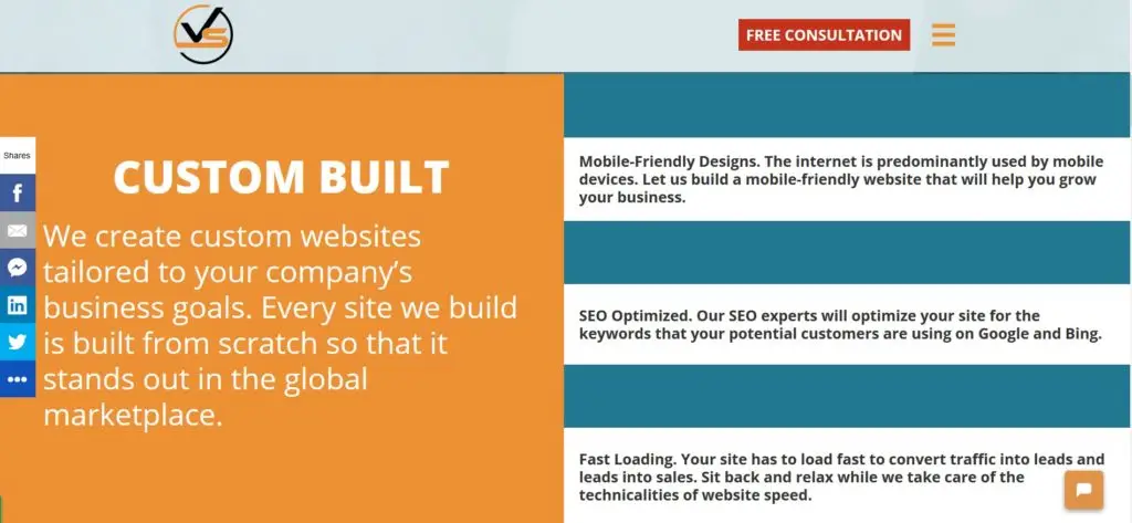
Now, as I shrink the browser window, the content starts to fold on itself as we make it smaller. No content is lost, and the user experience remains. No pinching and expanding required.
Making your website responsive is only half of mobile optimization though. The second way to create a user-friendly mobile experience is to design another website, strictly for mobile. A mobile-first design approach is ideal, as it satisfies users with easy-on-the-eyes design and unique features that cater to a mobile audience.
Mobile-friendly websites display cleanly on all devices and computers. They also aren’t clunky (which happens when using large images designed for desktops) and as a result, they load quickly, which is super important for users.
Here are some examples of features a mobile website may have:
- Easy access to directions to your store
- Easy way to contact you with clickable phone numbers and automatic chatbots
- Minimalist design
- Fewer images than a desktop site for fast load times: According to a DoubleClick by Google study, 53% of mobile site visits are abandoned if a page takes longer than three seconds to load.
- Simplified navigation
- Large thumb-friendly, easy-to-click sections that don’t require users to type
Here’s what our home page looks like on a desktop:

And here’s what it looks like on mobile when it loads:

Notice the large clickable green contact button at the bottom of the screen.
TIP: Some users prefer to browse a full site even if they are on mobile devices. Give users the option to browse your full site if they want.
Note that if you are on a tight budget, we recommend starting with responsive design first. Creating a mobile site will require a separate domain and higher maintenance costs. But, if you already run a responsive website and you want to take your mobile experience to the next level, creating a mobile site may be the way to go.
How to Make Your Website User-Friendly (And Visitors Happier)
Let’s talk about some essential user-friendly website tactics. They are equally important as mobile optimization and without them, you risk turning away site visitors and losing leads and sales.
When making your website more user-friendly, separate your improvements into two main areas: your navigation and body content. If you run an e-commerce store, optimize your checkout process as well. We won’t be able to dive into e-commerce checkout optimization in this blog post, but stay tuned for an upcoming post about it.
But, before we get into the improvements, you must have the following research in place before you move forward…
Know Your Target Audience
A user-friendly website allows visitors to find what they are looking for in the quickest time possible, right? If this is the case, how will you figure out what your users are looking for if you have no idea who they are, what their pain points are, and what solutions they need?
Disclaimer: It’s impossible to predict exactly what visitors want from your website without getting inside their minds. But you can get pretty darn close if you know your target audience. Plus, even if you don’t know what they want, making your site more user-friendly will remove the friction and give them more opportunity to find what they want themselves.
We talk about this subject a lot on the Viral Solutions blog and that is simply because knowing your target audience is THAT Important. We don’t even design websites for clients until we understand their target audience because it plays into so many website design aspects and increases website conversions.
Here’s some more information on target audience research and creating buyer personas:
Branding Series: Researching Your Target Audience
How to Create Detailed Buyer Personas for Your Business
Navigation / Site Architecture
User-friendly website design is so much more than creative graphics and flashy images. In fact, creativity and “flashiness” can detract from the user-friendliness of your website.
Many businesses strive to make their website flashier than their competitors’ while failing to take navigation into consideration. But, clean navigation and site architecture are what keep people rummaging through your website. Your website visitors want instant results. If they don’t find what they want quick enough, they will close the tab and move on. A million other websites are out there ready to be browsed. You need to give them a reason to stay.
Site architecture is an extensive topic, so we won’t be able to cover every detail here. But, we will distill the most important elements to help you improve your current website navigation and body content.
Menus / Navigation
Avoid super creative navigation menus. It’s not innovative to place your menu navigation bar at the bottom of your website because no one else is doing it. No one else is doing it…that should tell you something.
Users expect to see the typical menu navigation at the top of your website or at least somewhere near the top where they can find it. Don’t go against natural behavior.
Left and right-side navigation menus are also popular, but they are typically seen on creative agency websites. If you do choose a side navigation menu, make sure it starts close to the top and stands out so it is visible.
Avoid elaborate fonts as well. Your font should be crisp and easy to read.
Use User-Friendly Language and Avoid Jargon
Let’s say you are targeting internet marketers with your SaaS tool. A layman may call search engine results, “Google listings.” But, knowing your targets, you would use a more commonly used phrase such as “search engine rankings” so they know exactly what you are referring to.
While you want to use words that showcase your expertise in an industry, avoid industry jargon. Remain professional and write to the reading level of your audience.
Avoid Clutter; White Space Is Your Friend
If you take one tip away from this article, let it be this: White space is your friend.
You can see this on our home page. Here is a screenshot of a small snippet.
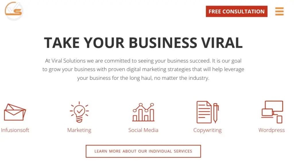
Notice how the elements are separated and the copy is clear and easy to read.
Cluttered websites are distracting and confusing. Keep enough space in between elements so they have their own place and users can identify their function easily and without confusion.
Focus Your Content
In an attempt to satisfy website visitors, marketers often give users too many choices, thinking that the more they offer, the greater the chance they will take action. But, this works in reverse.
Each page should have no more than one or two focuses. Otherwise, your visitors will be confused and get paralyzed with decision-making.
As an example, your pricing page should display your pricing and only content related to your pricing. Don’t link to your about page, your blog, and your social sites and add more calls to action. Those page links are okay in your site-wide navigation, and if people want to visit them, they know where to look.
Clear Calls to Action
Make your calls to action visible and clear.
I like User Testing’s fresh, modern website design that includes a call to action on the home page. Your eyes are drawn to the headline first, which states a product benefit. Underneath the headline mentions more user benefits and also a solution to the target’s problem, without crowding the site with too much copy (Tip: You need to know your target audience to do this right. We told you how important it was). The call to action button is clear, and when users click it, they know what will happen (they can request a free trial). The design AND copy is crystal clear.
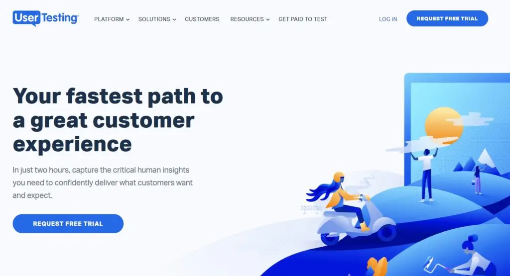
Remember our discussion on white space? The white space is plentiful here.
Purposeful Fonts and Colors
Similar to your navigation, use clean body content that is easy to read. Stay away from fonts such as Comic Sans or heavy cursive styles.
If you don’t already have brand colors, consider color psychology to determine which colors would match your brand and connect with your target audience. Incorporate those colors into your website without going overboard. Keep it clean and fresh.
Here’s a helpful guide on color, user experience, and conversion rates.
Why Is User-friendly Design so Important? Do I Really Need to Follow These Guidelines?
We mentioned this a few times already, but it’s worth repeating.
If you are not creating a rewarding and positive user experience for your visitors, they will exit your site (without converting).
And as you can imagine, this is bad news for your brand because it stunts growth and sales. But in addition to that, a poor user experience tells Google that your site is not worthy of ranking well in its search engine.
Google looks at engagement metrics to determine your website’s content quality. For example, if you enter a keyword in Google and click on a link to visit a page and quickly hit the back button to try the second link, this data suggests to the search engine that users are not finding what they are looking for when navigating your website. And Google is not going to rank your website if people don’t like what they see.
A user-friendly website enjoys a high time on page (metric for user engagement) and low bounce rates. This is how Google defines bounce rate:
A bounce is a single-page session on your site. In Analytics, a bounce is calculated specifically as a session that triggers only a single request to the Analytics server, such as when a user opens a single page on your site and then exits without triggering any other requests to the Analytics server during that session.
Bounce rate is single-page sessions divided by all sessions, or the percentage of all sessions on your site in which users viewed only a single page and triggered only a single request to the Analytics server.
This may seem a little technical, but it’s not all that complicated. The main point here is that you want to make sure your website is user-friendly so Google takes to you kindly.
But how do you do that? Here are some ways to find out
How long are users staying on your site?
If the majority of your users are exiting your website in less than a minute or two, you will need to do some digging to figure out why they are leaving, and adjust accordingly. You can find this data (time on page, bounce rate) in your Google Analytics account.
Note that a low time on page is desirable for landing pages where you want people to opt in. A low bounce rate could mean that the user found what he was looking for (this is a good thing). To mitigate this, analyze these metrics per page and assess them according to your overall goal for the page.
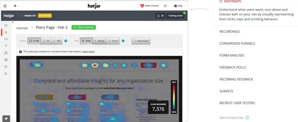
Spy on your visitors
Did you know that you could watch videos of users browsing your website? Use tools like Hotjar to view heatmaps and monitor user behavior via videos to get an idea of where users are dropping off your website and what features they are enjoying.
Here is an example of what Hotjar can show you:
User Testing
User Testing is a platform that hires human user testers to browse your site and offer feedback via real-time video. Give the user a task to complete and watch them navigate (out loud) what they find and what they like (or don’t like) about your website. You can even select your tester’s demographics and test mobile and desktop websites or in-app experiences.
Is Your Website User-friendly?
If you can’t answer this question with an emphatic “yes” (based on real-time data), with a few tweaks you can improve your website and satisfy your visitors. This will increase your leads and sales conversions and reward you with a hefty ROI.
Here at Viral Solutions, we design websites with empathy. The user is at the forefront of our strategies and the result is increased leads and sales for your business. If you would like to learn more about our process and how we design websites, click here for more information.
