


How to Make Your Website Stand Out – Part 2: Website Content Tips and More

Trying to get your website to stand out from the 1,707,060,408 websites currently published on the internet can seem pointless.
The truth is that it is pointless.
In the 2 seconds it took you to read that last sentence, 15 more websites just made their debut. By the time you’re done reading this post, more than 100 websites will have been published.
How in the world can you compete with all of these websites? The simple answer is you can’t. And the good news is that you don’t have to.
You only need to be better than your competitors are—that is, the websites in your industry.
But, don’t get too smug just yet. “Standing out” is not as simple as adding a few images to your website. Your success hinges on understanding exactly how to captivate your visitors and keep them engaged so they take ACTION on your website (e.g., buy your products, contact you, opt in to your email list).
We’re continuing with our 2-part series on how to make your website stand out. In Part 1, we discussed the technical requirements of high-performing websites such as how to improve user experience and how to secure reliable, effective website hosting.
In Part 2 below, we are getting into some critical design and website content tips that, when executed correctly, will make your website more engaging and attractive to your website visitors.
As we mentioned in Part 1, this topic is quite extensive. We could write an entire course on website content tips alone. But to help you put a plan into action right now, we decided to distill some of the top components of high-performing websites.
Let’s dive in!
How to Make Your Website Stand Out: Make It Clean and Free of Clutter
Users are looking for a positive online experience, and 68% of consumers say good display and design are a priority when viewing professional and personal content.
Creating a professional website design, however, is not as easy as slapping up a template and calling your website done. While we are not against the use of website templates, customizing your website to fit your brand and audience is key to making your website stand out.
Here are some important points to remember when it comes to engaging website design:
Clean Layout and White Space
Do you find yourself addicted to adding new things to your website? Clutter is the ENEMY of conversions.


You may think that the more opportunities you give a visitor to convert, the better. Though this may work in theory, it doesn’t work when it comes to websites. In fact, the fewer calls to action you give visitors, the better the chance they will convert. Conversely, the more options you give them, the longer it may take them to arrive at a decision, which lowers conversions.
Hick’s Law, named after psychologist William Edmund Hick, is a popular theory cited in website design circles. The law demonstrates the relationship between the number of choices a person has to make relative to the time it takes them to make that decision.
The more options you give people, the longer it will take them to make a decision.
The solution? Remove clutter and unnecessary content.
How do you remove clutter from your website?
One way to figure out if your website is too cluttered is to define ONE purpose for each page. Then, review each page and ask yourself if every element on that page points to that goal. If not, remove it.
Notice how Keap’s (formerly known as Infusionsoft) features page is 100% focused on the software’s features, and that’s it. You will not find any random ads, unnecessary sidebars, or random content.

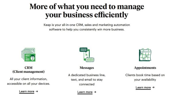
Notice how clean the page is, evident by the amount of white space. More white space equates to a stronger focus on the elements in between that white space. If this page had more elements on it and the images were closer together, they wouldn't stand out as much as they do.
When the content stands out, it’s easier to read and digest, which increases visitors’ time on your site.
Here’s the thing: Your visitors don’t want to work hard to find the information they are looking for. If this process is difficult, they will leave and visit your competitors’ websites.
Note that your home page is one of the few pages where it’s okay to divert from one single point of focus. This is because when people visit your home page, they may not be exactly sure what they are looking for, so introducing more content on the home page can increase conversions.
But (and this is a strong but), this doesn’t mean it’s okay to clutter your home page. We recommend keeping one space on your home page where you practice the “one focus” principle, and that is the section above the fold, or the content users can see before they have to scroll down the page.
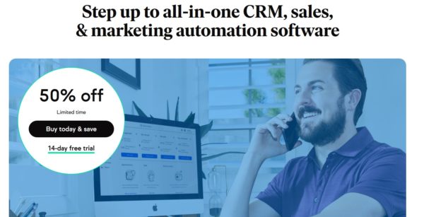
Keap’s home page links to various parts of the website, but the top part above the fold has one focus—to direct people to sign up for a free trial:

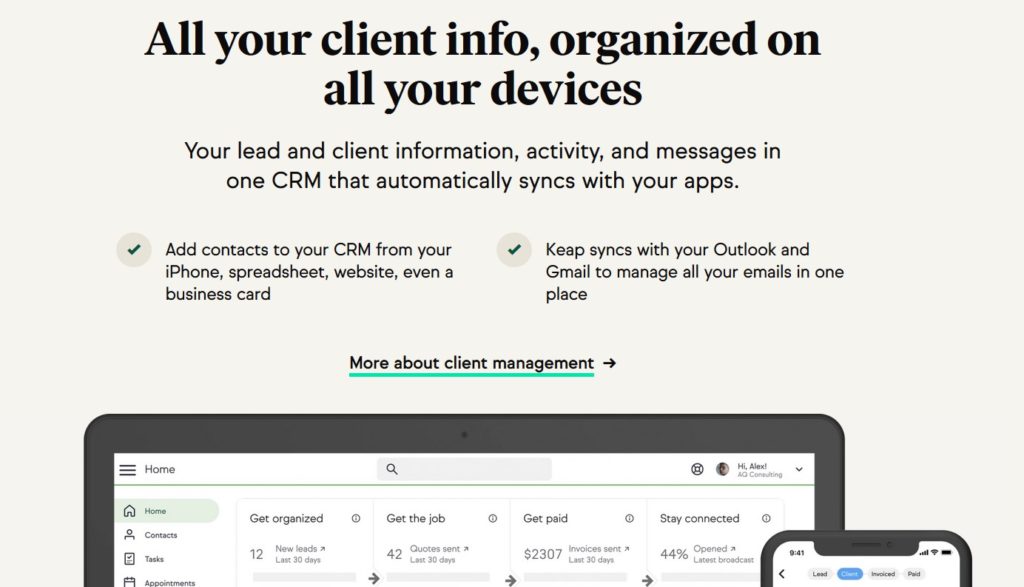
If visitors decide they don’t want to sign up or they want more information, they can scroll down the home page and visit the other content Keap highlights—the key benefits of its software’s features:

Here’s the TLDR:
- Keep one focus for each website page so as not to dilute the main purpose of each page.
- Home pages can have multiple focuses, but keep one focus for the “above the fold” content.
Website Content Tips: Can You Capture Your Visitors’ Attention in 8 Seconds or Less?
You may have read website content tips all over the internet that note you only have 8 seconds to engage a website visitor and keep them interested. We would argue that this is too long. If it takes more than a few seconds for visitors to find what they are looking for, they will hit the back button.
How do you get your visitor to pay attention to your website content?
Here are some website content tips that contribute to higher user engagement.
Content That Speaks to Your Targets’ Needs
You have to connect with your website visitors right away or you will lose them. This requires an understanding of what your visitors want, what their deep needs are, and what type of language resonates with them.
If you haven’t created customer avatars or done market research, do this first before you create or improve your website content. This research will help you better understand your audience’s needs, problems, and objections. Use this research data to create your website content so you can captivate visitors and keep them on your site longer, compelling them to convert. Here’s a handy guide on market research.
Readable Content
Is your content clear, formatted correctly, and easy to read? When creating content for your website, the second most important rule of thumb is to make it readable.
This means leaving a good amount of white space, using bulleted lists, avoiding large blocks of text, and creating compelling benefit-driven headlines that beg to be noticed. (Hint: You also need to know your target audience to create high-converting headlines.)
Let’s take a look at this excerpt from our website. Notice how it is formatted.

Now, here’s what it would look like if it weren’t formatted for easy reading.

Which one would you rather read?
Attractive Elements
In addition to formatting, you need to include compelling imagery that depicts the main benefit or purpose of the page. The imagery should also cause visitors to be drawn to your calls to action. This is especially important if you are attempting to generate leads with your website by providing a free offer.
At first glance, it may look like this graphic from Hubspot’s home page is pretty simple, but there’s a lot of conversion elements at work. Let’s dissect each one:

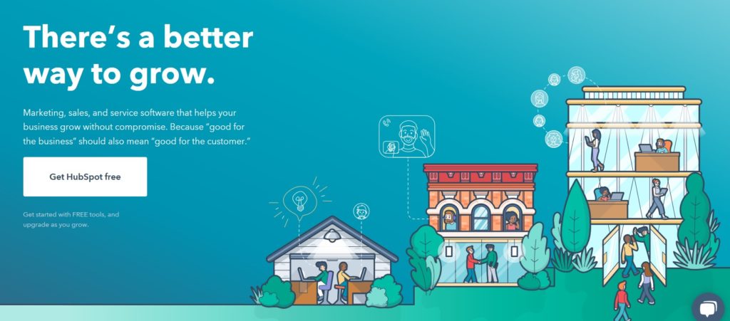
Headline:
The headline speaks to users’ pain point of struggling to grow their businesses, but it also cleverly evokes curiosity and begs the user to ask, “Is there a better way to grow my business than I have been?”
The purpose of the headline is simply to grab enough attention to keep the visitor on the page. If a visitor feels connected to the headline, they will feel like they are in the right place and hang around a little longer.
Body Copy:
Below the headline, the body copy reemphasizes the benefit (helping to grow business) and gives a little more insight into what the software is and how it can help the visitor.
Call to Action:
Below the copy is a large and clear call to action button. The white button color stands out from the blue background, and the button copy, “Get HubSpot free,” tells visitors they can access the software for free to try before they buy.
Below the button is a small amount of text explaining the free trial, and it reiterates that the software is in fact free until the customer is ready to upgrade. This little text snippet removes skepticism from the visitor and handles their objections to converting on the free trial.
Compelling Imagery:
Lastly, the image on the right is professional and doesn’t overwhelm the call to action. It allows the call to action to stand on its own, but it’s also compelling enough for visitors to take notice.
PRO TIP: Creating high-converting website design and content elements takes practice. Add to that, you never truly know what converts on your website until you test different copy and design variations. Once you create new design and content elements, split test each change to determine which one performs best with your audience.
How to Make Your Website Stand Out: What You Need to Know
In this article, we talked about how to elevate your website design and content to increase conversions, as well as attract and engage website visitors. In doing this, you will get more people to convert on your offers.
Some of the design and content aspects we discussed are how to make your website design clean and free of clutter, and how to ramp up your website content and calls to action to engage more visitors.
What’s next? It’s time to implement these tips and improve conversions. If you have a template you need help customizing, or you need a professional eye to point out where you can improve to boost leads and sales, we’d be happy to chat with you. Consultations are free, so go ahead and set up a time to talk. We look forward to it!

